My Quantified Email Self Experiment: A failure

Paul Ford on looking back, digitally :

My big idea was: If I can quickly look through all of my old emails I will be able to observe how my thoughts have evolved. I’ll learn something fundamental about myself and how I’ve grown as a person —for example, the difference between being in my early 20s and being 40.

This seemed like an interesting thing to do, so I did it. But the experiment was a failure, and not very edifying.

→ Medium

Why Oil Prices Came Down, And Won’t Anymore

Historically, Saudi Arabia has played a stabilizing role in world oil prices, by adjusting its output to ensure global supply is stable. The above graph show how Saudi output increased to lower prices when they were high, and vice versa. However, since July, the Saudis have not responded to newly low oil prices by decreasing output. In fact, the Kingdom have insisted that they would rather bear lower oil prices than decrease their market share (read: be squeezed out by shale).

→ Stats Life

Another Reason We Don’t Apply the 80-20 Rule

You’ll get one more reason by clicking the link down below :

The 80-20 rule sounds too good to be true. If 20% of inputs are so much more important than the others, why don’t we just concentrate on those? In an earlier post, I gave four reasons. These were:

  1. We don’t look for 80/20 payoffs. We don’t see 80/20 rules because we don’t think to look for them.
  2. We’re not clear about criteria for success. You can’t concentrate your efforts on the 20% with the biggest returns until you’re clear on how you measure returns.
  3. We’re unclear how inputs relate to outputs. It may be hard to predict what the most productive activities will be.
  4. We enjoy less productive activities more than more productive ones. We concentrate on what’s fun rather than what’s effective.

→ John D. Cook

Blue Period: Analyzing the Color of Paintings with R

The image above shows the color spectrum of almost 100,000 paintings created since 1800.

In an article for Significance magazine, Martin suggests a few possible reasons why paintings are getting bluer with time:

  • The colour blue is a relatively new colour word.
  • An increase in dark colours or black might drive the effect if these contain more blue or if the camera register them as blue to a larger extent.
  • The colours in paintings tend to change over time, e.g. due to the aging of resins.
  • Blue has historically been a very expensive colour, and the decreasing price and increased supply might explain the increased use.

→ R-Bloggers

Reality = Normal + Fat-Tail Distributions

To illustrate the phenomenon, consider the S&P’s daily percentage returns in terms of quantiles, which divides the performance record into equal-sized portions. The graph below plots the sample return of the S&P (black circles) against the theoretical quantiles (red line), defined here by a random distribution. If the S&P’s daily returns were perfectly random, the black circles would match the red line.

sp.a.25sep2014

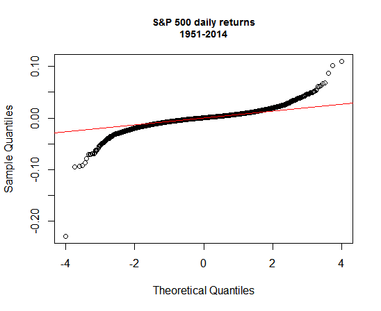
Normal distributions are still useful for analyzing markets and designing portfolios. Indeed, even in the daily return plot above it’s clear that the distribution looks quite normal for a fair amount of the sample. We can’t rely on normality alone for modeling markets. Factoring in fat-tails risk is essential. But letting a fat-tail worldview dominate your analysis is every bit as flawed as assuming that normal distributions will prevail. Asset pricing doesn’t neatly fit into one theoretical box, which means that our analytical tool kit shouldn’t be in a conceptual straightjacket either.

→ The Capital Spectator